For those who wish to trade their cryptocurrencies under the cover of darkness.
Read MoreDark Theme for Coinbase

Product Explorations
For those who wish to trade their cryptocurrencies under the cover of darkness.
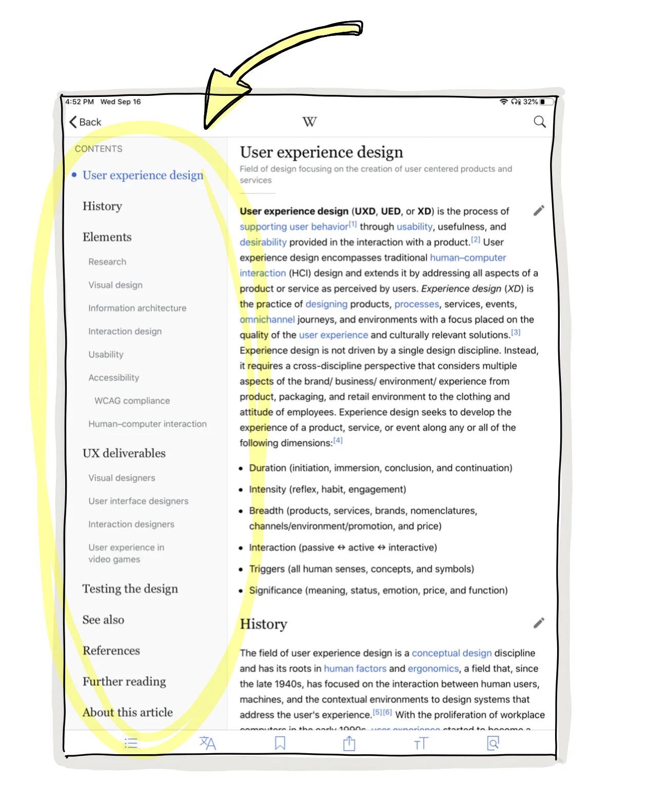
Read MoreTo make falling down the rabbit hole of Wikipedia a little less dizzying, I've been working on a Chrome extension which aims to improve the information architecture of any Wikipedia article a user visits.
The primary difference is that the Table of Contents has been moved from the body of the page into a sidebar which allows the user to maintain a high-level overview of the page content while they scroll.
S/o to my friend Jon Senterfitt for being willing to help me out with this project.
We made the sidebar width adjustable, so that's cool.
Sorry this gif is so low-res, I asked @GIPHY if there's a processing time or something to get a higher resolution gif, since the source video I provided was a lot clearer.
Updated Sep 2020
Long after building this, I discovered that Wikipedia’s iPad app has a sticky table of contents. It even includes a smooth animation when scrolling to different page positions. Perhaps we were onto something, after all!
An idea for the Open Source social media project, Mastodon, to show trending topics in an easily digestible interface, with less clutter than Mastodon’s competitor, Twitter.
Read MoreUser interface should step out of the way of your content. Google Photos already hides your searchbar as you scroll. They should also hide the footer to give your photos the maximum attention they deserve.
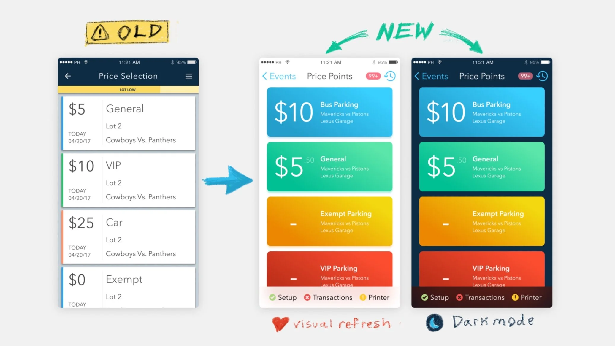
Read MoreHere are two (2) suggestions for Figma Designer to help make it a bit more user-friendly and magical to use.
When toggling "Hide UI", the interface abruptly disappears and reappears (on the right side of Fig. 1a. )
It'd be delightful if the UI elements were swept away (dark green position graph) from the center of the screen and subtly faded out of sight. (light green opacity graph) as indicated below in Fig. 1b.
Fig. 1a.
Fig. 1b.
Figma thankfully allows users to set a background color for the whole project, which is a welcomed feature coming from Sketch, which locks you into using a white background.
Unfortunately when using a dark background, the layers panel (left sidebar) and the inspector panel (right sidebar) are blindingly bright. Not only are they pure white, their typefaces and elements are thin and light.
To make the layer and inspector panels more readable, I propose that the UI of both change in accordance to the set background color of the project. I prototyped what this could look like in the column on the right.
To make the Google Drive Activity Feed a bit easier to browse, it'd be nice if we could click to collapse events into smaller rows. If you're auditing your company's recent Drive activity, it'd make it much easier to navigate.
(Fig. 1) Position of the Activity Feed in Google Drive
By splitting each action into a "header" and a "body" section, it's easy to conceptualize a "collapsed" view for the Activity Feed.
(Fig. 2)
I'd like to try to build a working prototype of this idea. First I'll need to research whether or not there's a Google Drive API that allows users to pull data from their own Drive's, then I'll need to try to rebuild the existing user interface with the collapsibility functionality as described above.
When somebody adds multiple photos in a Facebook post, the gallery is shown in a nice pretty mosaic view on your timeline. If there are more photos in the album than are shown, theres a small "+number" on the bottom right image.
One might think clicking the "+n" would expand to show more photos in the mosaic. Instead, clicking the "+n" only opens the last photo (red) in the pop up window.
Here's a mockup of what I wish clicking the "+n" button would do: expand the album mosaic to show the additional photos.
Somewhat related to this: I'd love to see Facebook add a filmstrip to the bottom of the photo viewer pop-up window. It makes it easier to navigate through albums by giving you a bird's eye view of the context of the album.
Feature requests for Google Maps, to help us improve our understanding of our planet.
On this page:
- Typical Traffic Graphs
- 3D on Mobile
- Snapshot of ideas
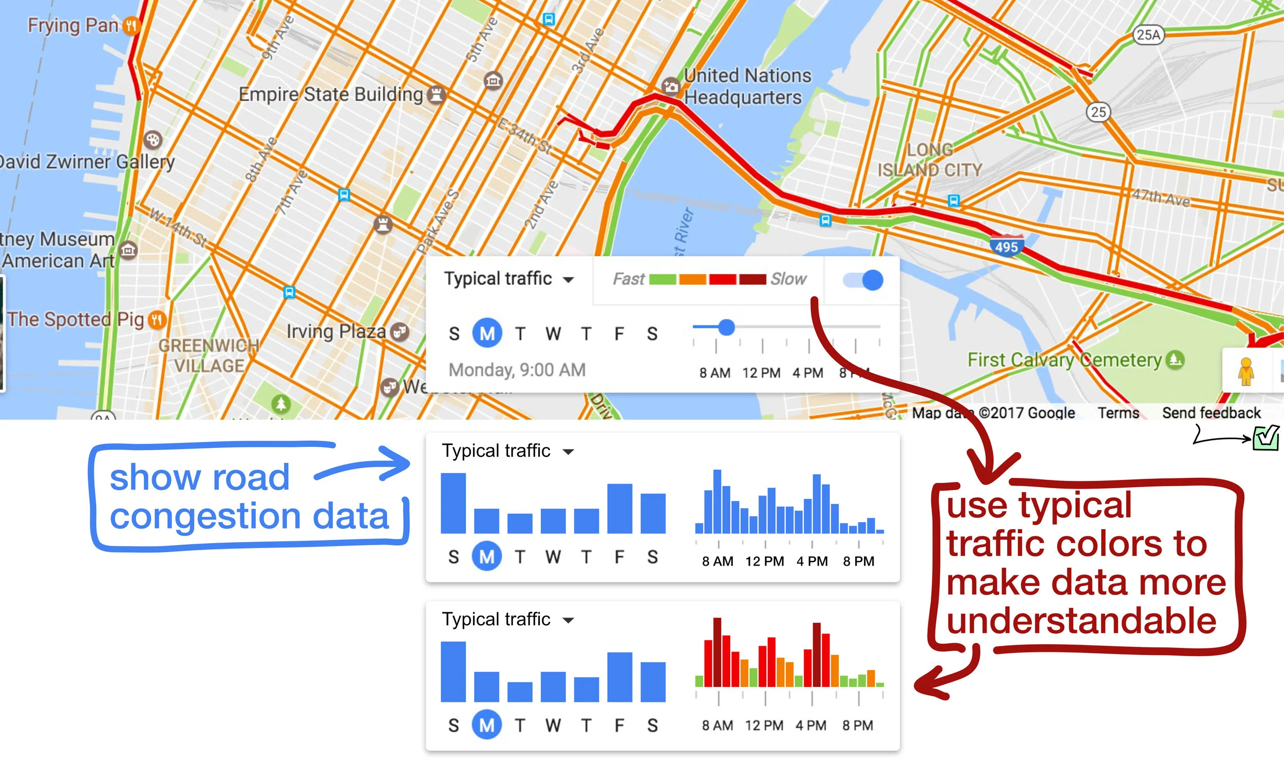
For those of us trying to avoid traffic, a "congestion timeline" would be very valuable. Google already has a "Typical traffic" slider to illustrate which roads are usually the worst, but it doesn't show a timeline. Here's a user interface prototype I've made to illustrate this idea.
Diagram 1: Bar graphs illustrate traffic data per weekday, and per hour given the selected day.
As the user scrolls and zooms to view different areas, the graphs should automatically update, with smooth "ease in" bezier animations.
EDIT: as of June 2017, Google now provides graphs to indicate how long a specific trip might take depending on the time of driving (i.e. longer during rush hour, etc)
I've annotated a screenshot of this new feature below, where I indicate the need for more granularity, as well as the ability to more fully explore the dataset. (all 24 hours of the day, instead of the nearest 3 hours)
[tweet]
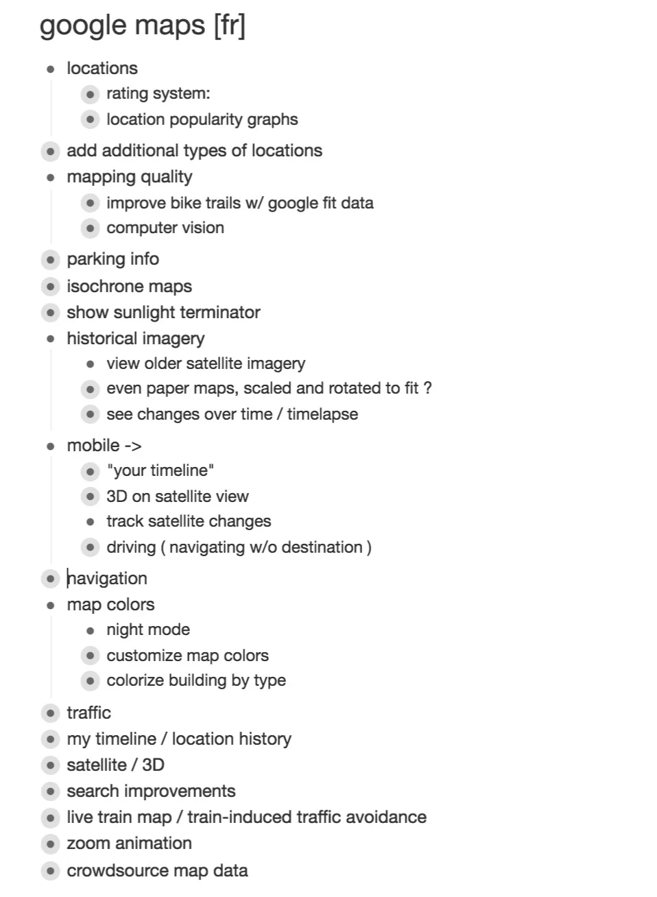
I look forward to publishing more feature requests for Google Maps and mapping technologies in general. Here's a collapsed screenshot of my feature requests ( [fr] ) for Google Maps.
Some feature requests I've come up with for Twitter over the years.
A feature request for all platforms, both mobile and desktop to improve the user experience of looking through tweeted photos.
made a pretty feature request for our friends at @twitter
— Jamie Gray (@jamiefeedback) December 26, 2016
please let us pinch to zoom out in the media tab
@feedback @TwitterDev @design pic.twitter.com/1AFzcjdTpy
I will continue to populate this page with diagrams of my feature requests for Twitter, but until I do so, here's a collapsed list of the various ideas I have for them. (some of these might not make sense on their own, but they'll make sense when I publish them)
Screenshot of my Workflowy note of my Twitter feature requests (that's what [fr] stands for, this tag helps me quickly search for feature requests in my notes)